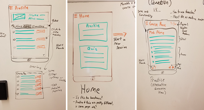
Low Fidelity Screen Mockups
Low fidelity mockups often consist of sketches, like the ones here, and are great for high-level brainstorming and collaboration. They’re void of meaningful color and even text, outside of a few keywords to denote events and page titles. These were the first set of screen mockups we created, which we used to establish a user flow. Prior to creating these, we mapped out user interactions that correspond with the app’s purpose and constitute an expected mobile experience. Creating these mockups allowed us to quickly determine what pages we’d need to incorporate all the actions the app offers. It also provided us a way with establishing questions for each of our initial screens that were then asked during our phase one user testing.
