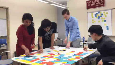
Affinity Diagramming
After we finished conducting all the interviews, we had a lot of data to analyze. We proceeded in doing affinity diagramming to transform our findings into concrete and useful design ideas. We transcribed all the interviews and wrote down important facts on sticky notes in such a way that we had just one fact per sticky note. Once we started the affinity diagramming process, we grouped all the facts together into different categories. Several themes came up as we tried to sort this data. We started to see patterns as we tried to tell each other what our interviewees had to say. Once we noticed that some themes had a lot of facts under them, we tried to re-organize the sticky notes into sub themes to group all the facts more meaningfully.
This brainstorming process was really useful as we came up with some feature ideas based on the 35 emergent themes. Our interviewees belonged to different age groups ranging from 26 to 61. Most of them were married and had kids. Even though our interviewees had very diverse backgrounds, different work schedules and degree programs, it was really interesting to see similarities in their study habits, work schedule, mobile usage, motivation and so on.
Affinity diagramming also reaffirmed some of the predictions we had made before going into the interview process. It also brought several new facts to the surface which we hadn’t thought of before such as the different course and program level strategies that the students take, the third party resources they use in addition to the existing WGU course materials and so on.